

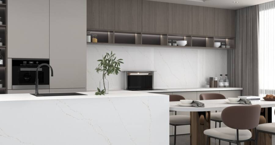
The empty space above kitchen cabinets often goes overlooked, but professional designers see opportunities to add character, texture, and practical storage. From displaying vintage ceramics and woven baskets to installing wine racks or eye-catching wallpaper, thoughtful decorating choices can transform an otherwise neglected area. Understand how designers use the space to create kitchens with greater personality and visual appeal.
Why Designers Pay Attention to the Space Above Cabinets
Most homeowners overlook the zone above their kitchen cabinets, filing it away as dead space or a spot for items they rarely use. Designers take a different view. They recognize that every surface in a kitchen contributes to the overall atmosphere of the room, and the area above the cabinetry is no exception. Rather than letting it fade into the background, they treat it as an opportunity to introduce personality, layering, and even practical function.
Country Living editors have noted that the space above kitchen cabinets provides a great opportunity to display favorite collections, and that most homeowners likely already own everything they need to decorate the area (source). That perspective reframes a commonly neglected zone as one full of untapped potential.
Vintage Pieces and Collected Objects
One of the most popular designer approaches involves placing curated vintage objects in this overhead space. New York interior designer Megan Pflug favors vintage ceramic vases for this area, noting that they balance style with functionality and are easy to maintain (source). Ceramics carry a handcrafted quality that softens modern cabinetry and adds a sense of history to a room that might otherwise feel too new or too polished.
Antique apothecary jars in warm amber glass offer a similar effect. In kitchens with stark black-and-white color schemes, those earthy tones bring in a lived-in quality that keeps the space from feeling cold (source). The key, as many designers explain it, is selecting pieces that feel like they belong to the kitchen rather than objects that were simply placed there to fill a gap.
Texture and Layering for a Less Sterile Kitchen
Designer Samantha Stathis Lynch takes a texture-forward approach when styling above cabinets. She recommends incorporating materials that differ from the cabinetry itself, with antique wooden cutting boards serving as a specific example, because those contrasting surfaces make the kitchen feel layered and lived-in rather than clinical (source). Woven baskets achieve a similar result, introducing warmth and natural fiber into a space that typically features hard materials like wood, stone, and metal.
Mixing textures also prevents the above-cabinet display from looking like a flat arrangement. When pieces vary in surface, height, and material, the eye moves across them naturally, treating the collection as a visual element rather than a storage solution.
Functional Installations That Look Intentional
Some designers move beyond decorative objects entirely and install functional elements in the overhead space. Krantz Designs, for example, mounted a modular wine rack above eggplant-colored cabinets, creating a feature that serves a real purpose while making the kitchen feel more inviting (source). That approach works particularly well in kitchens where storage is at a premium, since every shelf and surface can contribute to the overall organization of the room.
Martha Stewart applied a similarly practical philosophy in her own farmhouse kitchen, where simple open shelving above the cabinets keeps the look tidy while allowing a striking pot rack display to remain the focal point (source). Functional and decorative elements do not need to compete with each other when the arrangement is thoughtful.
Bold Scale and Dramatic Silhouettes
Kitchens with vaulted or especially high ceilings present a different challenge. In those spaces, small objects tend to disappear. Designers Arianna Pannoni and Kasey Bedford of Winsome Interior Design addressed this by placing an oversized sailboat above the upper cabinets, recommending that homeowners with dramatic ceiling heights choose pieces with equally dramatic silhouettes (source). Scale matters as much as style, and a single large piece often reads better than a crowded arrangement of smaller ones.
That philosophy extends to wallpaper and pattern as well. Designer Tom Scheerer used a botanical wallpaper in a narrow gap above cabinets to pull together the green tones throughout the room, demonstrating that even a limited surface area can carry significant visual weight when pattern is introduced (source). A well-chosen pattern in a small space can tie together an entire room’s color story without overwhelming it.
Tailoring the Approach to the Kitchen’s Style
What works above cabinets in a coastal kitchen will not necessarily translate to a farmhouse or a contemporary urban space. Designers consistently tailor their choices to the existing character of the kitchen. Vintage signs and ironstone collections fit naturally in farmhouse settings, while sleek ceramics and structured baskets suit more modern environments. The goal is coherence, making the above-cabinet display feel like a deliberate extension of the kitchen’s design language rather than an afterthought.
This approach also extends to the arrangement itself. Repeating a color, material, or shape across several pieces creates a sense of intention. Mixing items of varying height keeps the display from looking flat. And leaving some breathing room between objects prevents the space from feeling cluttered, which is especially important given how difficult this zone can be to clean regularly.
Why Learning More About Above-Cabinet Design Is Worth the Effort
The space above kitchen cabinets is one of the most consistently underutilized areas in any home. Designers across every style category have demonstrated that it can hold everything from handcrafted ceramics and woven textures to modular storage and bold wallpaper.
Whether the priority is visual interest, practical function, or both, this overhead zone offers more possibilities than most homeowners realize. Exploring what professional designers are doing in this space reveals not just aesthetic inspiration, but a practical framework for turning a forgotten ledge into one of the most characterful details in the kitchen.